Blog, News & Events
Crafting the deBoulle Experience
Welcome to the VIP treatment.
By Eileen McClelland, from Instore Magazine August 2020
QUICK FACTS
OWNERS: Denis and Karen Boulle
URL: deboulle.com
FOUNDED: 1983
OPENED FEATURED LOCATION: 2001
LAST RENOVATED: 2020
ARCHITECT AND DESIGN: Gensler
SHOWCASES: Faubion Associates Inc.
EMPLOYEES: 20; AREA: 9,000 square foot showroom; 13,600 total square feet
TOP BRANDS: deBoulle Collection, Patek Philippe, Rolex
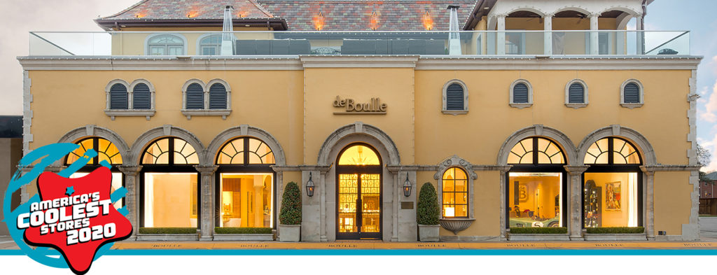
deBoulle has been named America’s Coolest Jewelry Store by INSTORE, the magazine for the North American jewelry store owner. The Dallas, TX, business took first place in the Big Cool division for stores with six employees or more.
More than 80 stores took part in the 19th annual contest that highlights the best examples of independent jewelry retailers in North America.
“Every year, we feel privileged to bring our readers the best of the best in our industry,” said Trace Shelton, INSTORE’s editor-in-chief. “From its warm, modern showroom to its cozy lounge and 1959 Le Mans-winning race car replica, deBoulle certainly qualifies. But a store wouldn’t really fit our ‘cool’ criteria if it weren’t for such aspects as innovative marketing, creative retail environment and a unique work culture.”
Stores are judged in exterior appearance, interior appearance, store biography, marketing, web presence and overall individuality.
When Karen and Denis Boulle began consulting with store designers about the reinvention of their 20-year-old Dallas flagship store, it soon became clear that in addition to making the space lighter, brighter and more modern, they had something more unusual in mind.
They wanted room for a race car.
The Boulles have a personal interest in racing, and their son, Nick, is a deBoulle team member as well as a professional driver. deBoulle has a motorsports division, which has allowed Nick to compete in endurance racing such as Le Mans and the Rolex 24 Hours of Daytona. Nick has won first place at the Rolex 24 Hours of Daytona and this year was awarded second place in the same race.

“Yes, it was an unusual request, but it’s very much a part of what they do beyond jewelry,” says Laura Loreman, interior-design associate with Gensler, the global architecture, design and planning firm. “It ties into who they are as a family and aligns with their brand. Even just displaying the awards would be a fun little moment in the store. So why not take it a step further?”
Last year, deBoulle partnered with Aston Martin, as well as the family of famed driver Carroll Shelby, and an artist who had recently painted a portrait of Nick from a race at Le Mans. The event, called Tour de Force, explored Shelby’s racing legacy, which tied in with the unveiling of the “Ford vs. Ferrari” movie and commemorated Shelby’s 1959 win at Le Mans. The intimate event included cars, portraits, jewelry and, from the vault of Carroll Shelby, a Patek Philippe timepiece.

At the beginning of December, the Boulles, ready to unveil the 1959 Le Mans-winning car replica in the store, had the newly installed front doors removed to make room.
The Boulles’ interest in cars, Denis says, has had a huge impact on the business. “Over the years, we have found that many of the people who collect cars also collect jewelry and watches,” he says. “Plus, the branding and marketing side has been very helpful in making deBoulle more than just a jewelry store. It is an extension of the deBoulle lifestyle. We often invite clients to racing events all over the world: from Daytona Beach in Florida to Spa in Belgium to Le Mans in France. Our VIP racing experience is incredible, and the ultimate experience. Our clients are part of all the action in the pit and get the chance to become part of history.”
Denis says many Dallas clients are just as passionate about cars as the Boulle family and will stop by to show off their latest acquisitions. “People get excited to show off their brand-new Porsche or McLaren, which we enjoy because we love cars just as much and it adds to the experience.”
“I think this is also the case with having a race car on display in the store. People just can’t get this experience anywhere else.” Long before the “where to put the race car” discussion, Karen Boulle had been telling her husband that it was time to update their Dallas store.
It was still beautiful, of course, and had been built to look like a French-style villa. But what had been the height of elegant jewelry-store design 20-plus years ago, and one of America’s Coolest Stores in 2007, had started to look dated and dark, Denis concedes.
“We all agreed we needed to modernize the flagship store and offer a cohesive experience across both our Dallas and Houston stores,” stated Denis.
In 2016, deBoulle’s Houston store, designed by Gensler, was featured as America’s Coolest Store and considered by the Boulles to be a prototype for future ventures. At the time, Karen described the Houston space as open and welcoming, classical and timeless, and neither too cutting edge nor old fashioned. Gensler incorporated residential design features into that space, particularly in the comfortable yet compact lounge area. The Houston store occupies less than 2,000 square feet, while Dallas has a 9,000 square foot showroom, allowing a much more expansive canvas for expanding on themes introduced in Houston.
“We always try to make our clients feel at home while shopping with us,” Karen says. “Our Dallas store feels more like someone’s home with its bigger seating and bar area. We wanted the remodel to be modern and current, and really showcase the jewelry and the watches, just like Houston.”

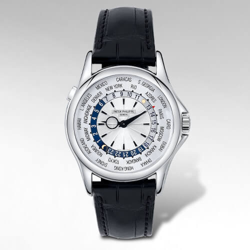
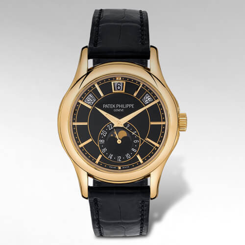
The Dallas renovation would coincide with the addition of what they describe as their crown jewel, a second Patek Philippe dedicated showroom. The one they opened in Houston was the first in the world.
Plans for the extensive remodel included painting, plaster, lighting, flooring, jewelry cases, metal work, carpeting, new furnishings, offices and cabinetry and updated bathrooms. And it would be fairly tricky, since they had no plans to close during the process.
“Until the COVID-19 closures, we have never chosen to close our store in over 36 years of business,” Denis says. “So, for me, it was never an option, regardless of our extensive remodel.” They closed off most of the downstairs space and served clients in the bar area. “We had very limited showcases,” Karen says, “but we could still serve drinks and make people happy.”
The design proceeded one zone at a time. The Boulles were amazed by how many people shopped during that time, driven, at least in part, by curiosity. “It was almost like they wanted to see what was inside of the tornado,” Nick Boulle says.
“We are grateful that we had our customers’ support during construction,” Denis says. “And, I owe a huge thanks to our employees for how they handled the remodel, because it was a nightmare. I don’t know how everyone kept their cool and composure with the awful noises and jackhammers going off.”
Despite the challenges of working in the eye of the construction storm, glitches were few. Karen had found two sparkly, eye-catching chandeliers from Italy, which were carefully installed by electricians over a few days. “Just as we thought they were finishing up,” says Nick, “they realized that the chandeliers were not UL certified. So, they had to take them down. The chandeliers were put back in their boxes and sent to another location, reassembled to test to ensure they met code, fully taken apart again, and then returned and installed at the store, for a second time.”
For this project, as they had for Houston, the Boulles turned to Gensler. Loreman, who also worked on the Houston store, studied the size and shape of cases and floor-plan possibilities to reimagine the space without significantly revising the architecture. “A lot of the meetings we had were spent tape measure in hand, making sure we had all the proper distances and clearances and appropriate heights,” Loreman says.
Before the renovation, cases were tall and had the effect of closing off the voluminous space somewhat, creating an obstacle and obscuring visibility. Now, lower case heights draw people in, both visually and physically, rather than stopping their progress. The airy and inviting design celebrates the arched ceiling that runs down the center of the store. The lighting, too, draws attention to the space. “The chandeliers helped ground everything and they give the cases below a sense of place in the store,” Loreman says.

Candle cases, the taller vitrine cases in the back of the store, are illuminated to both draw the eye and set the stage for the transition to the Patek Philippe showroom. Wall colors are warm and cool gray tones, combining residential warmth with modern crispness. While the palette is simple and neutral, a variety of texture and patina adds interest. The effect is to give the whole store a consistently lighter look, to align with the Houston store and to complement the Patek Philippe space. A dramatic addition, a spiral staircase designed by a local artisan and fabricated in steel, is intricately fashioned to reveal the deBoulle hallmark, an emerald-cut shape.
At the heart of the store is a tradition of hospitality. A cozy lounge with cappuccino station and well-stocked bar remains in place next to the sprawling fireplace. Bright yellow chairs provide energetic splashes of color and echo the trademark color of deBoulle.
For the Boulle family, success flows from what they love to do, whether it’s racing, entertaining, designing jewelry or forging relationships with a top watch brand.
“Since opening in 1983,” says Denis Boulle, “We have lived by the idea of following our passions – offering customers premier collections of fine jewelry, luxury timepieces, and impeccable service in a beautiful and friendly environment that radiates our love of design and lifestyle. We call this the deBoulle Experience, and this is what makes shopping with us a VIP style experience.”
JUDGES’ COMMENTS
- KATHLEEN CUTLER: The website is easy to navigate and I love the clear branding, including the logo and color scheme. The bridal page is well done. I appreciated that they didn’t list the price, but instead encourage an in-depth conversation with the option of booking a viewing prominent on each page. Instead of relying on the website to convert, they know that they will have to sell the piece through a one-on-one relationship. deBoulle has done a great job encouraging conversations.
- KEN NISCH: The Patek Philippe showroom and customer lounge are standouts.
- ERIK RUNYAN: deBoulle jewelers is top-shelf. First impression is everything: beautiful family, beautiful jewelry store, luxury events and luxury packaging. deBoulle looks like a store both men and women could spend hours in. Their social media is what I would inspire my staff to create. You have to mention Nick Boulle’s racing history. How cool! deBoulle is like the Kennedys of the jewelry industry. Well done.
- PRATIMA SETHI: The Boulle family story is strong with a rich history and heritage reflected in the interior design of the store and the building itself. The business overall has a more traditional appeal. The website is clean and easy to navigate. The images on Instagram are great and have a contemporary angle. The connection with motorsports is a nice niche, making the story even more unique.
- JEN CULLEN WILLIAMS: This is an absolutely beautiful store that radiates elegance and sophistication, yet is also creative and welcoming. The tour de force event they hosted that tied into the movie “Ford vs. Ferrari” with cars, portraits and jewelry was very innovative and exciting.
- ROD WORLEY: At every client touchpoint, the deBoulle brand message is purposefully conveyed to the smallest detail. The use of the second floor Holland & Holland bespoke gun boutique is brilliant. deBoulle is a prime example of how jewelry should be woven into an immersive client experience.
Five Cool Things About deBoulle
- IN-HOUSE MARKETING. All marketing is produced in-house. From social media to an annual magazine, the goal is to convey luxury and the deBoulle lifestyle. The annual magazine has twice featured model and spokesperson Niki Taylor as the face of deBoulle. deBoulle launched its new e-commerce website last year and designed it to be striking, elegant and easy to navigate. The marketing team works with professional photographers to capture deBoulle jewelry on models and in lifestyle and still shots.
- STAFF EXPERTISE. deBoulle has an on-site watchmaker and jeweler and two GIA gemologists; the remainder of the staff are pursuing GIA accredited jewelry professional degrees. Timepiece specialists have received training in Switzerland. The staff is versatile, all able to wear multiple hats in a team-friendly environment. Many have been employed for over 10 years, and some have been on staff for more than 20.
- COMMUNITY OUTREACH. From sponsorships and donations to events, deBoulle has supported Camp Sweeney, the Family Place, and the SPCA of Texas. They host charity events several times a year, often donating a piece of jewelry, which attracts new supporters. Their annual event with Camp Sweeney is a kick-off party for programs for children with type 1 diabetes.
- A FAMILY OF DESIGNERS. The deBoulle Collection jewelry is designed and curated by Karen, who is attracted to unusual gemstones and inspired by her childhood travels. Last year the collection began to include men’s jewelry designed by son Nick. Additionally, collaborating with daughter Emma, who has joined the business, Karen created fun and affordable designs that appeal to a younger clientele.
- THE NAME. The Boulle name stems from Parisian André Charles Boulle (1642-1732), who became known for his skillful work in the field of marquetry. His style of work was eventually dubbed “Boulle.” In French, “de” means “of” or “from” — “of Boulle” or “from Boulle.” Having “de” in front of your last name in France also carries stature in the French language and in Europe.
